AZB-FA-TomatoSoup-LO_ss3.jpg

Arizona Biltmore

AZB_Signage_Box1_ss.jpg


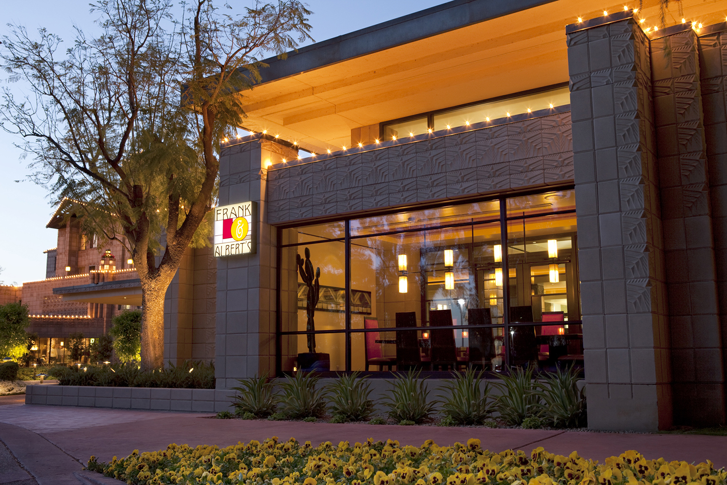
The architectural icon Arizona Biltmore, located in Phoenix Arizona was a long standing client I produced a variety of work for while working at The Starmack Group. One project in particular was the brand development of a new restaurant called "Frank & Albert's". It was named after the two architects who helped build the hotel - Frank Lloyd Wright and Albert McArthur. As lead designer I helped create the logo, colors, personality and collateral for the new restaurant.

The logo was based off of Frank Lloyd Wrights signature stained glass design, which was part of the American Arts & Crafts movement of his time. Warm colors give nod to the comfort-style food the restaurant serves.

 
 
AXM_Stationery_Box2_ss.jpg


As part of the overall brand identity I created a loose draftsman style design throughout the collateral, incorporating architectural renderings, linear lines, and splattered ink highlighting the casual mood and ambiance of the restaurant. 


AXM_Pattern_Box3a.png


The personality of Frank & Albert's really came through in the tongue-and-cheek headlines developed for some of the collateral which focused on the imagined relationship of the two architects. This was displayed boldly in a series of birthday cards, coasters, napkins, as well as print and digital advertisements.


AZB_Chef_Box5_ss.png

Agency: The Starmack Group  /  Copywriter: Michael Duffy  /  Design: Hannah Rhodes